Redesign for an user-unfriendly and bland UI interface.
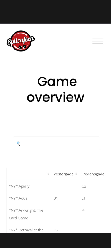
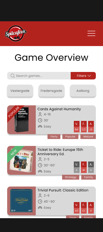
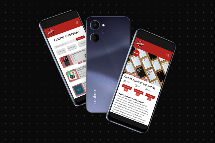
A redesign of Spilcaféen’s game overview page, as the current (at the time of writing) interface is, while functional, very feature dry and unpleasant to look at. My proposed redesign keeps Spilcaféen’s brand identity in mind, while focusing on adding useful features and staying readable.
As part of a school project, we were tasked with redesigning the popular Spilcaféen’s game overview page, as the current version was based off of an excel spreadsheet, with not much design added.
Redesign Objectives
Improve readability and clarity, improving the UI’s look and feel.
Improve brand recognizability and bolster Spilcaféen’s identity.
Add useful search features, such as a tag system and filters.
Challenges
The most challenging part of the process was definitely figuring out what features to prioritize and display first in the hierarchy to make sure the UI was as user-friendly as possible. The issue of displaying filters was also brought up. Should they be always visible? Or tucked away in a dropdown menu? These were the questions I set out to find answers to.
Features
Filters
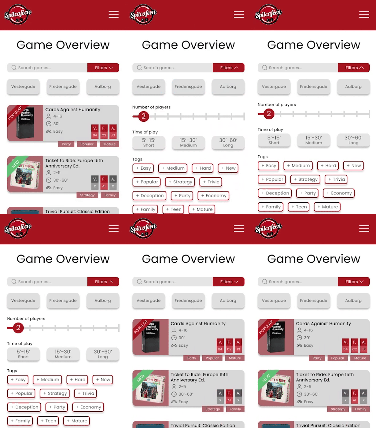
Due to the amount and expand-ability of filters, I have decided to hide them in a dropdown menu, as to make sure to show the user a few games on the first glimpse of the page.
Filter dropdown menu
I kept the location and search bar filters always visible due to them being the most important of the bunch. Making sure people could always just search up a game that they were looking for, or filter out the locations they weren’t present at.
Modular Cards
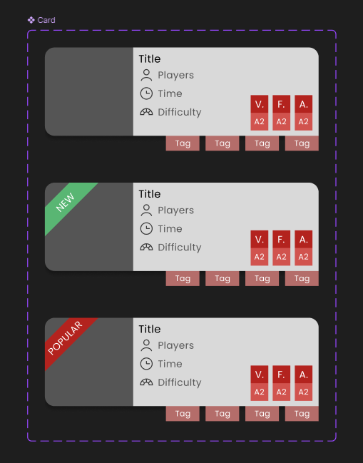
Since the cards are the main point of the solution, and are supposed to be fully customizable, I decided to make them into a component with variants. This makes them easily modifiable at any stage of designing.
Card component
Game Detail Page
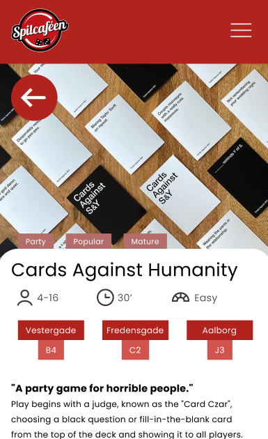
To give users some extra information on a specific game, I designed this games detail page. It provides them with basic extra information and descriptions, as well as reinforcing information found on the cards.
Game detail page
This addition also caused the cards to become clickable, as that’s the way that users would get to this page. I then decided to indicate that interactivity by adding a subtle drop shadow to the cards themselves.
Learnings
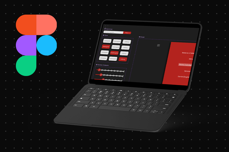
Through my process of creating this redesign, I picked up many valuable skills in Figma as well as design knowledge, among those, I’ve highlighted a few major learning points:
01
How to create easily-modifiable components.
02
Better understanding of constraints of a mobile UI.
03
How to convey a lot of information in a simplified manner.